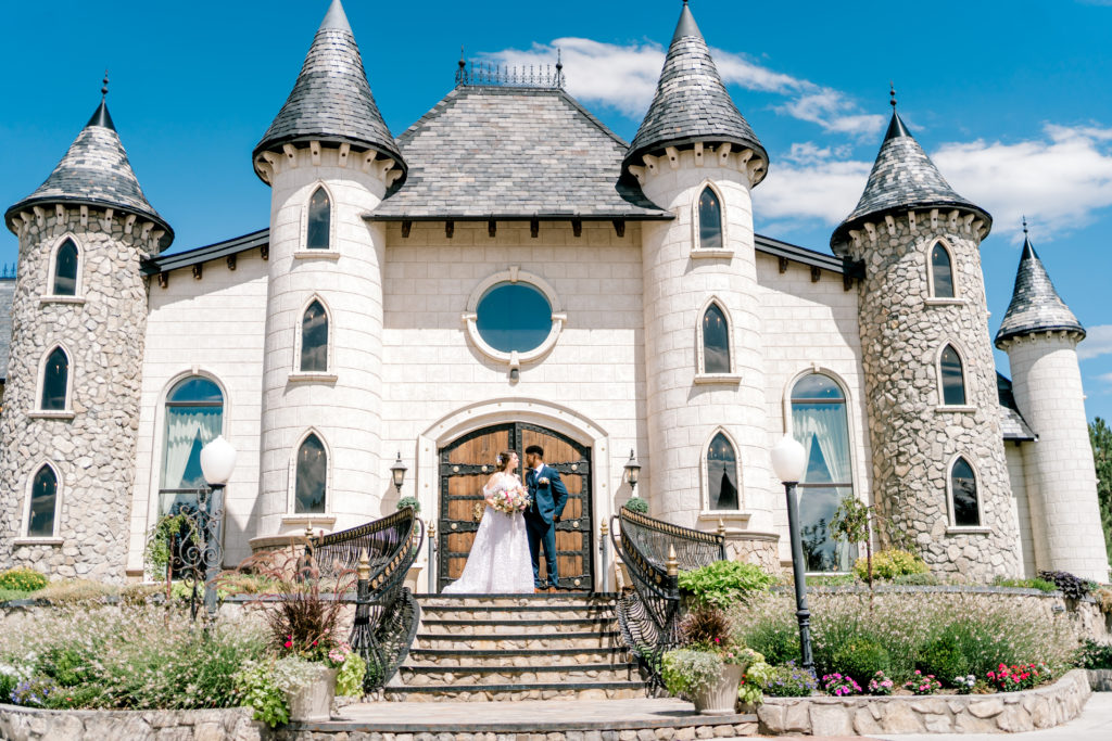
One of the very first decisions that many couples make during their quest to create the perfect fine art wedding is the colors they will be using! This can be a seriously daunting task so we thought we might share some of our absolute favorites to help get your brain moving.
Getting Started with Wedding Color Palettes
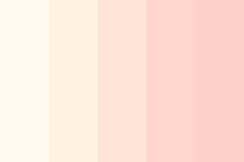
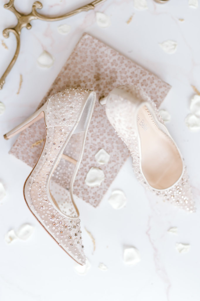
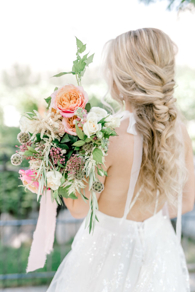
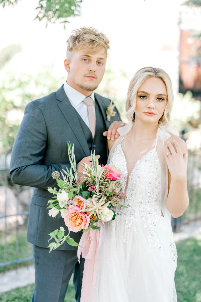
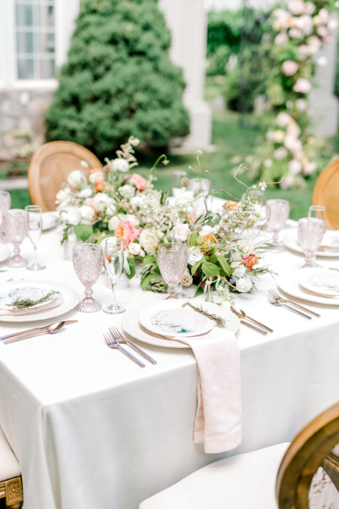
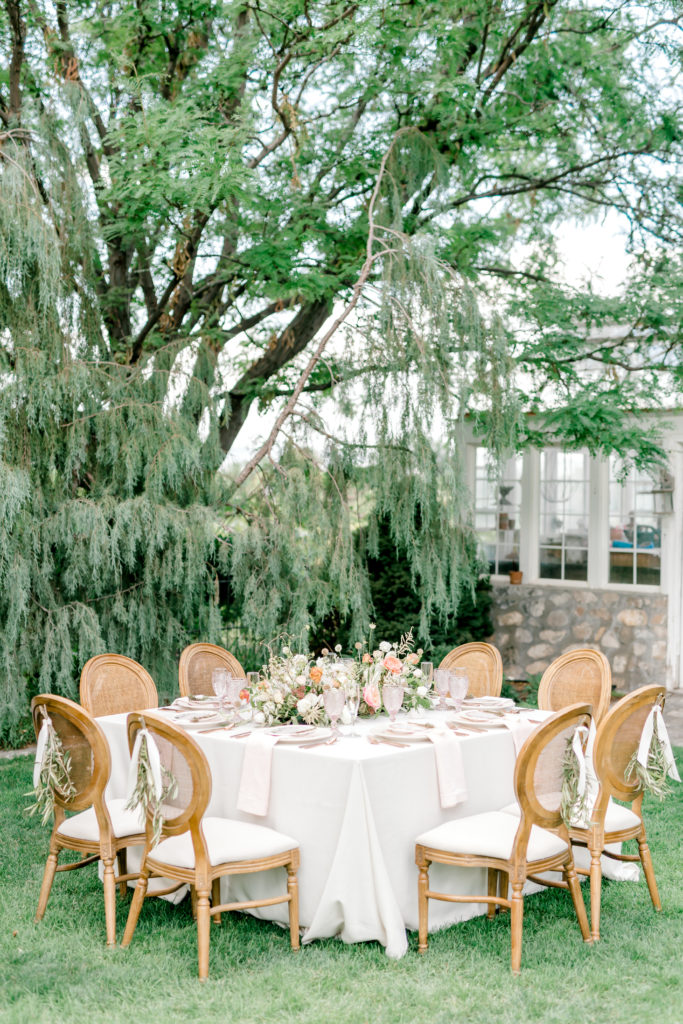
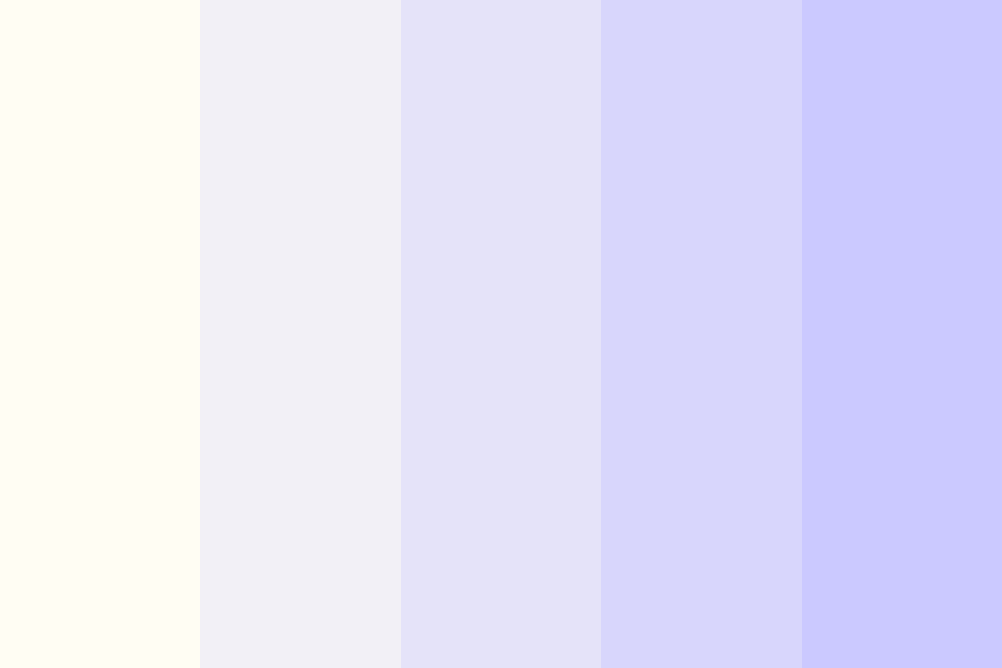
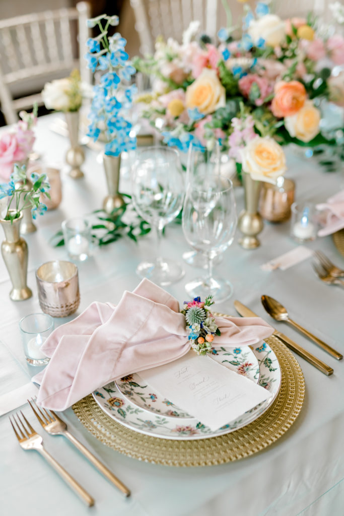
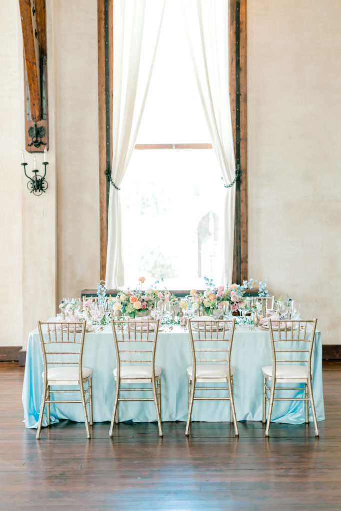
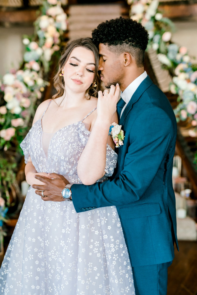
First, start with a neutral main color. Usually the fine art minded couple will start with white, but you don’t have to! A solid slate, stone or cream color can make an excellent base as well.
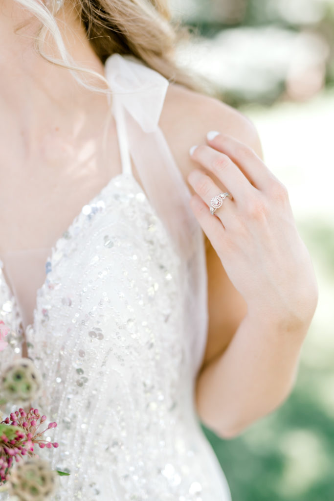
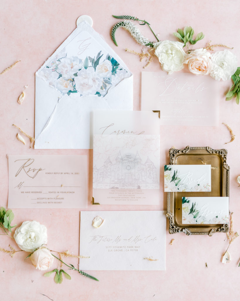
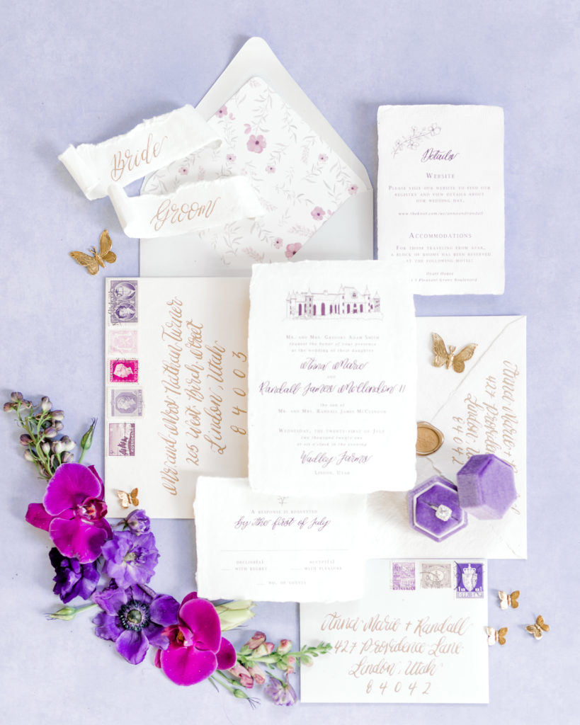
This is the color you want to use for your table linens, invitation suites and filler florals. Using the same color throughout will help provide a cohesive theme that feels beautiful, natural and elegant.
Next you’re going to look for a color compliment that you can use for your to fill in the gaps between your base color and your statement color that we will talk about here in a second.
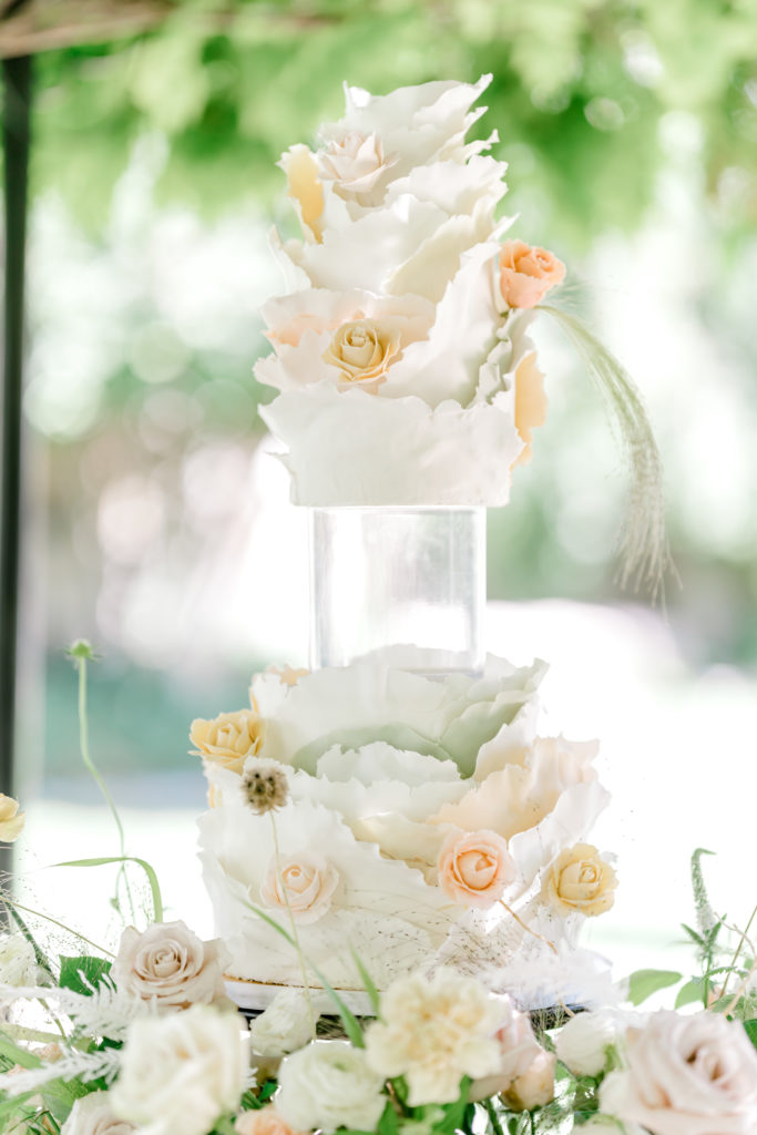
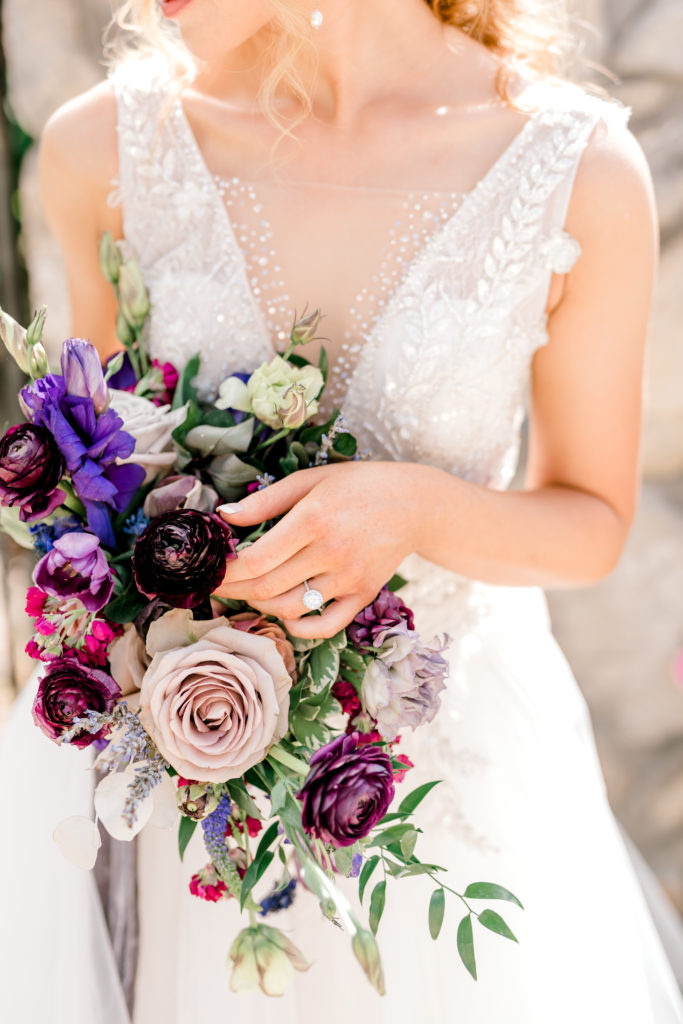
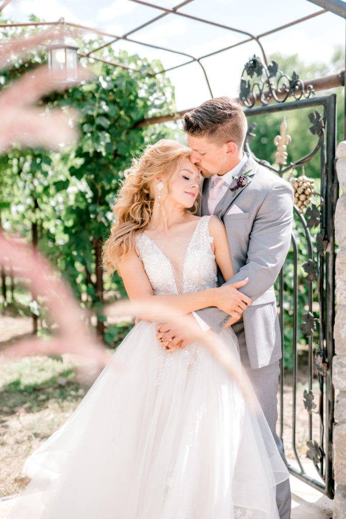
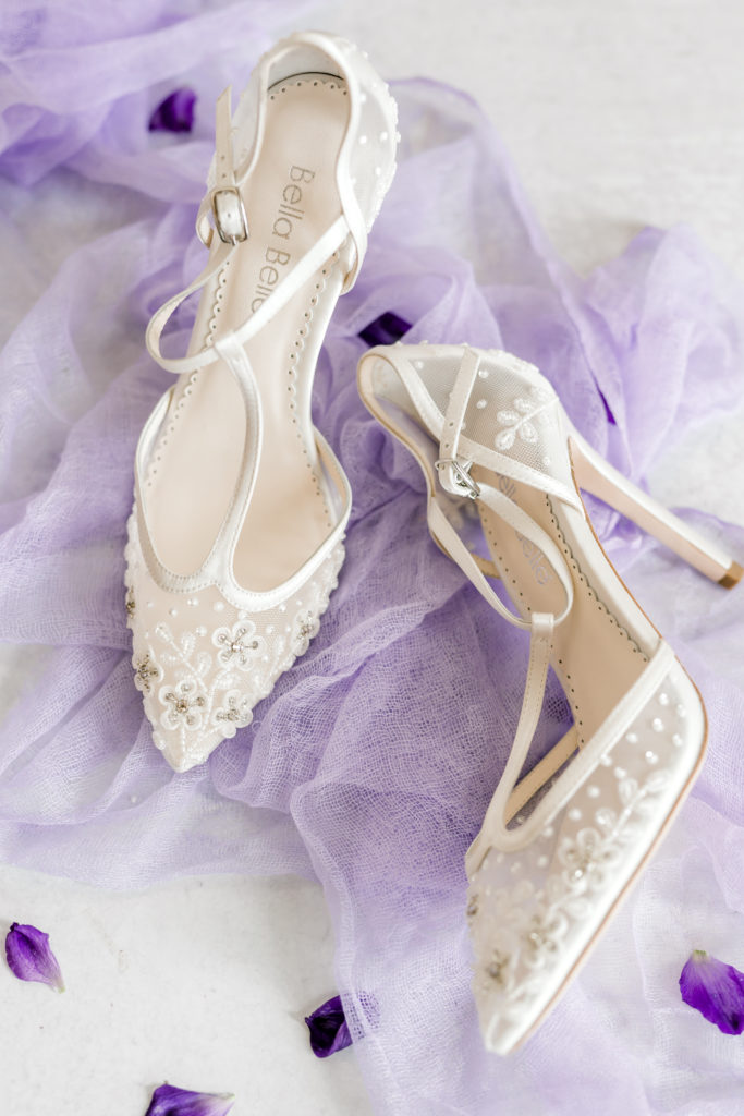
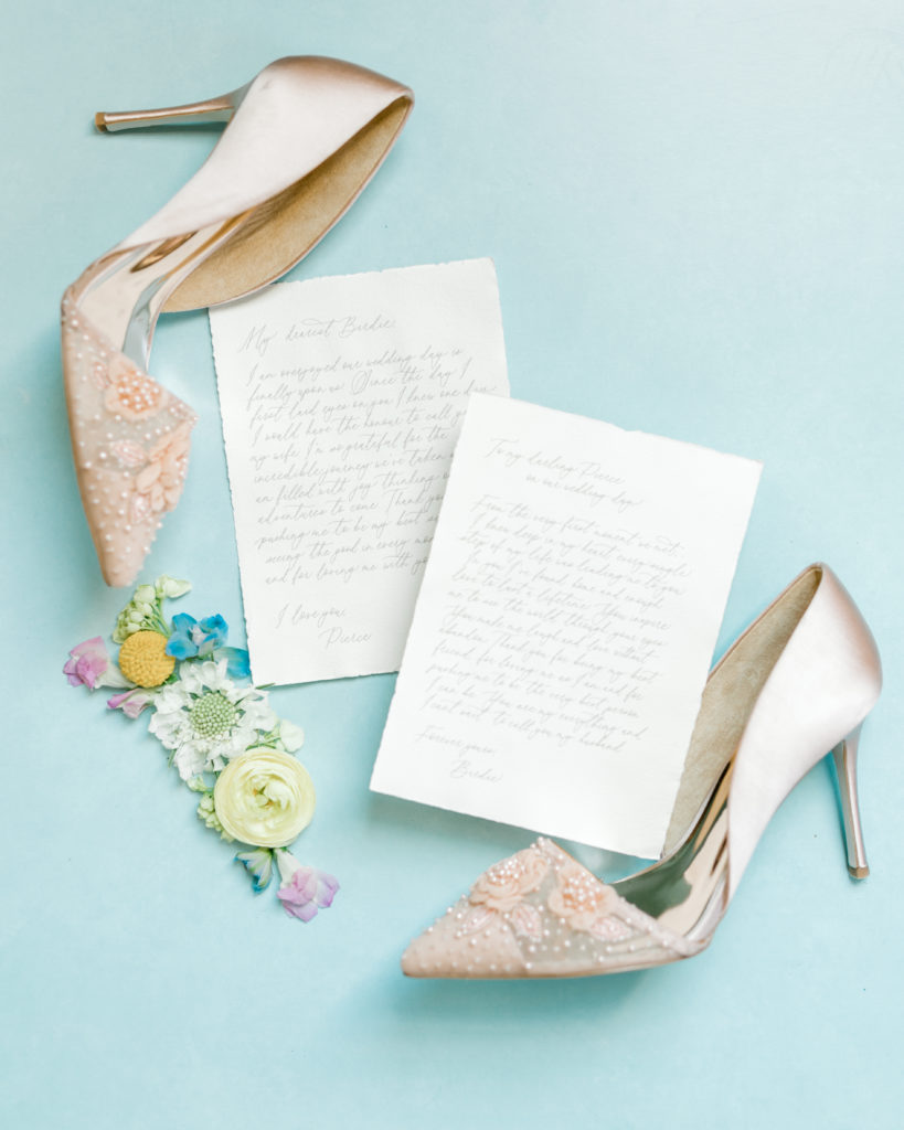
Your ‘middle’ color should still be pretty neutral and in fine art styling is often going to be a pale or dusty version of a hue. Think pale pink, dusty blue or a muted peach. Peaches and pinks in particular translate very well into fine art photography and create a dainty, soft and natural feel to your final imagery.
Statement Colors for Wow Factor
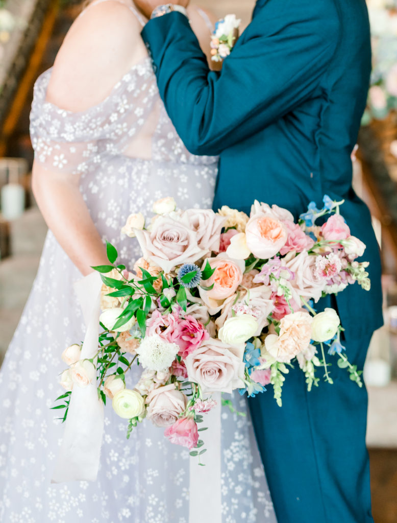
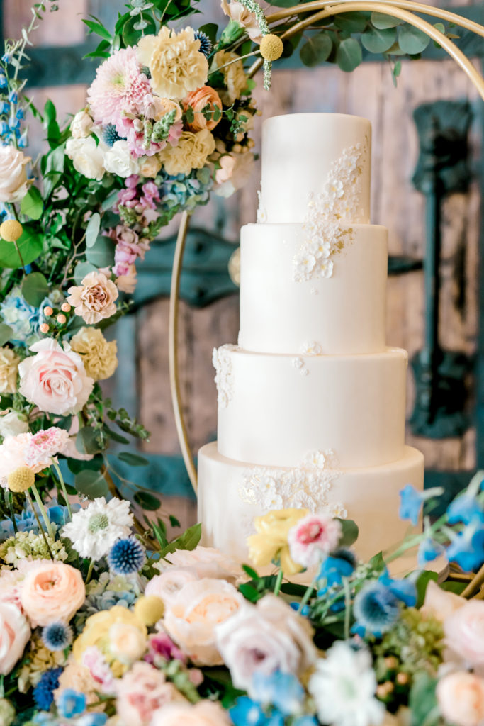
Finally you get to pick your statement color. There are a few rules here though, stay away from anything that doesn’t compliment your middle hue- pull up a color wheel if you need to and choose either an analogous or triadic color scheme.
What NOT to Do
Further, specific to fine art weddings, avoid a loud color like red or hot pink. These do not translate as well for a soft and romantic feel and will bring the attention to the colors you’ve used rather than on the two of you.
Conclusion: The Art of Color Coordination
Color plays a pivotal role in setting the mood and theme of a wedding, and the choices extend beyond preferences; they reflect a couple’s personality and vision.
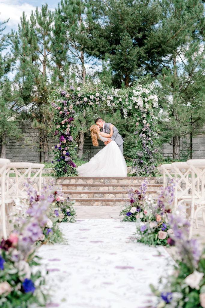
The utilization of these muted tones, when artfully combined with other complementary colors and elements like greenery, can transform a venue into a visual masterpiece. It’s not just about choosing colors; it’s about weaving them into every aspect of the wedding, from the invitations to the centerpieces.
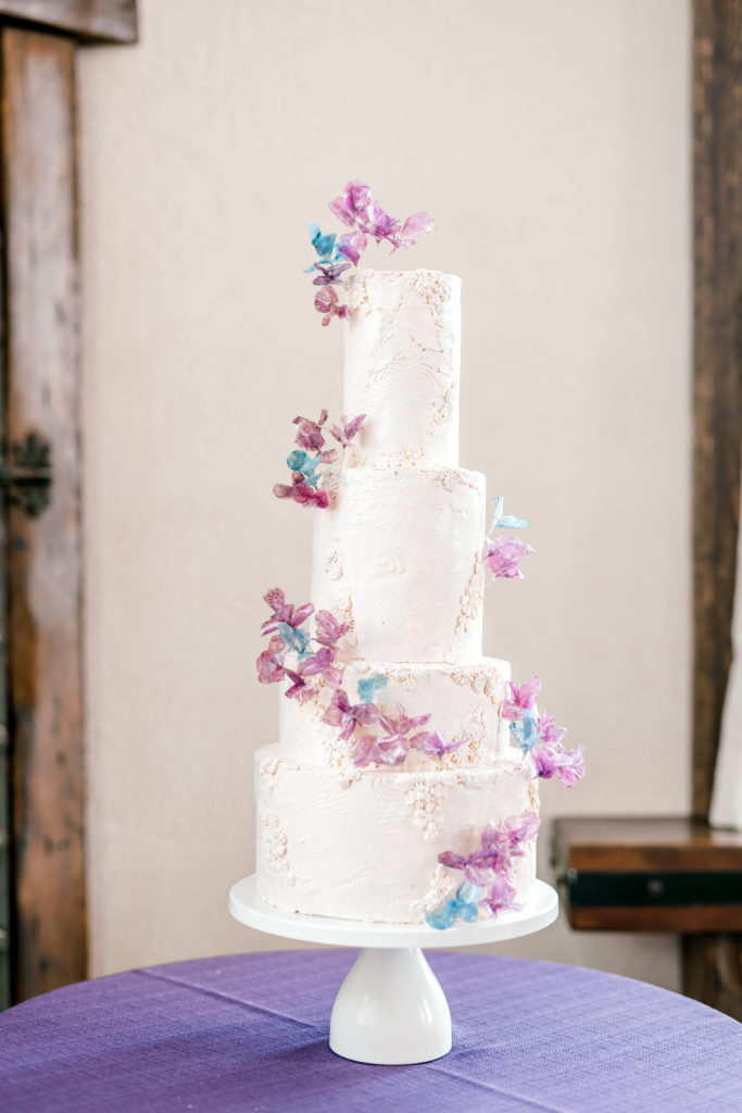
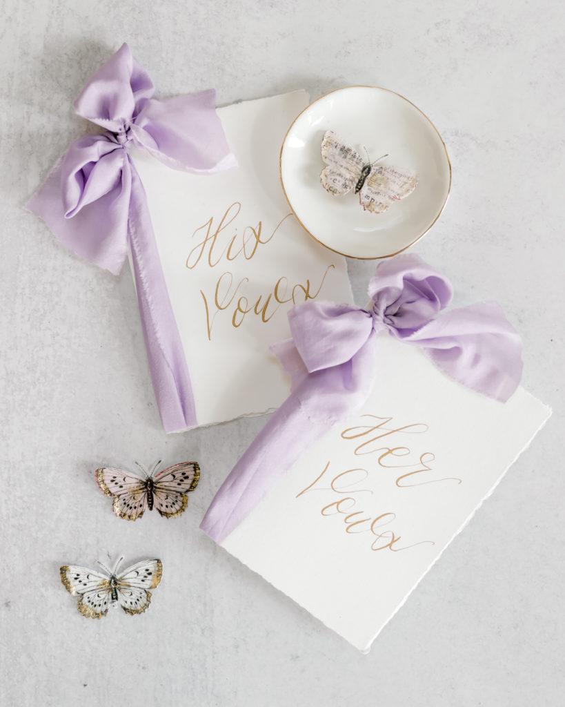
Check out the images below for some of our favorite color palettes. Notice the interplay of shades and textures, the delicate balance between boldness and subtlety, and the way greenery adds freshness and life to the compositions.
Embrace the creativity, consult with professionals if needed, and trust your instincts. The color palette you choose will become a lasting memory, an echo of a day filled with love, joy, and the artful touch of your personality. Your wedding is a masterpiece in the making, and the colors you choose are the brushstrokes that bring it to life.
Still trying to decide where to go from here? Check out these blogs to help you learn more about the wonderful world of wedding photography and videography with Rebecca Ann Aesthetic.


With love and romantic colors,
Becca & Mandy


